Monday 21 December 2015

Unused leaflet mock-ups

Although I liked the look and layout of this mock-up it was very difficult to read the information on the leaflet. Another more clearer mock-up was used in it's place.


I decided the quality of this mock up was not good enough to include in the final submission so it was replaced.


Alternative/unused designs

Unused leaflets:
The purpose of these leaflets were to outline some of the core values of anarchism to a new audience. These were presented in the forms of questions, this gets the viewer immediately invested and involved.
The values presented here are very progressive and inclusive and may surprise a new viewer, they may have not previously perceived Anarchism to be like this. Dis-spelling any misconceptions is a goal in this project.
Initially these were presented in 4 small leaflets but I thought these would be quite hard to distribute so scrapped this format and designed a single poster instead. This would be much more effective.


Unused/unfinished poster:

This posters purpose was to explain Contemporary Anarchism to a new audience. 3 values were arranged using the polygon theme that's been utilised throughout .
This poster remained unfinished as I didn't think would be be effective enough to get across the message of Contemporary Anarchism.


Sunday 20 December 2015

Colour choice

The colour choice of the brand was based on the traditional anarchist colour pallete, red, black and white. 


Traditional colour scheme


Instead of stark black, white and red I toned down the colours for a more contemporary feel. Keeping a familiar colour scheme will avoid alienating the current supporters of Anarchism while also opening it up to a new audience.  


New colour scheme

Monday 30 November 2015

Typography choice

The font I chose was Neou. The reason for this is because this font had a contemporary look without appearing too corporate. This is in line with the goals I set out regarding my target audience. 

Also the bold version of this text will be used in titles and the light version will be used in paragraph text. This will be used consistently throughout. 


Wednesday 18 November 2015

Target audiences

My target audience can be put into 2 groups; it's current underground audience that is familiar with the current brand and a newer younger audience. I want to target the 20 to 30 year old demographic.
This demographic, including the university student population, have been very vocal and passionate about current issues like university cuts, anti-war etc
There has been a number of large scale protests over the past few years and it is this audience I want to try and reach because I believe they will respond the most positively to my re-branding of anarchism.

Through my research I have concluded that the average age of the modern protester can range from 20 to 32.


Some articles to support a young protester:
Wall street protesters
College age protesters
Student led UK protests against University fees
Students against cuts


The way I will reach each group will be as follows;


Current group-

  • The brand must not lose its edge and become too corporate. 
  • The brand must still be recognisable. Using a similar colour palette.
  • The groups original values must me forefront of the design. 


New audience-

  • Push the groups positive, progressive values. The values that are important to the student protests of late. 
  • A clean and minimalist design will appeal to this group. Clear, concise and to the point. 
  • Re-assure audience that Anarchism is a worthwhile movement and dispel any misconceptions. 
  • The clothing line (t-shirts, hoodies) will appeal to the young audience. 

Tuesday 17 November 2015

Creating a dynamic logo

I wanted to create a dynamic logo that could be used on a variety of different backgrounds. Having a coloured version and a grey scale version wouldn't be enough. I wanted to create a number of different logos that all stemmed from the original logo, but were still instantly recognisable as part of the brand. This will give my brand more versatility and  allow the brand to remain fresh with the audience.
These logos consist of full colour, flat backgrounds, line work and also the 'A's without the circle. 


Refining logo (Colour)

This is a selection of refined logos that were developed from the polygon idea. The thinking behind the polygon structure is that is visually communicates some of anarchisms values; structure, organisation and networking.


Old v New
One of my objectives in this branding project was not to alienate the current audience that already supports Anarchism. I attempted this by not straying from the current colour scheme too much. Also the logo features an 'A' shape within a circle.
The circle originates from the quote 'Anarchy is order' by the anarchist theorist Pierre-Joseph Proudhon. The circle represents the 'O' in Order. So containing the 'A' within the circle is vital in appealing and reaching the current audience.


Ways it's similar to the old logo:
Colour scheme similar to traditional anarchist visuals.
‘A’ contained within a circle
Flat design

The un-uniform nature of the polygon shape echoes the lose design of the old logo. 


Ways it differs from the old logo:
More refined and balanced.
Although colour scheme is similar the colours have been muted slightly.
Isn't reminiscent of graffiti any more.


Monday 16 November 2015

Current political branding

As Anarchism is a social/political movement I thought it would be important to research what is most popular in political branding.
From what I can see flat design is very popular amongst political campaigns. Also the colour palate is limited to around 3 colours. The fact that this style of design is popular within political campaigns I can assume that it's very effective in communicating ideas and gaining support.

For my brand to be relevant within the political spectrum I need to consider this style of branding.

Photoshop logo concepts

After the logo sketching process I narrowed down the designs and created some more refined grey scale concepts. I believe that if I narrow down the logo design within the early stages of development it's influences the entire brands image. So this was an important stage of development.  
I tried to create logos that were a looser design and also logos that were constructed of clean lines to get a wide range of options to choose from. 
Some of the logos became too futuristic and even though I liked the designs they were not suitable for what I wanted to communicate. 
I also received some feedback that the cross bar of the 'A' on one of the logos resembled a rifle. This wasn't what I wanted to represent so I didn't pursue that design any further.


This is the logo concept I thought had most potential for development, This is just a font but it led me to develop this polygon structure more. I believe this interconnecting structure is very relevant to the ideas and values I'm attempting to communicate; structure, organisation and connecting people. (Connecting people as in coming together in mass protests).


Logo sketches

I began roughly sketching out logo concepts trying to produce as many designs as possible. Creating a number of logo concepts gives me a good starting point as I can then focus in on an design I see as working.
I wanted to update and modernise the current 'A' anarchy logo but also retain it's edge. Changing the logo completely would distance itself too much from the current brand so I thought it was important that the focal point of the brand was still the 'A'. 
Before beginning sketching I had in mind that I wanted to create a logo that visually communicated some of the values of contemporary anarchism such as; structure, organisation and networking. This could be accomplished by designing a balanced logo with interconnecting lines.


Friday 16 October 2015

Current imagery associated with Anarchism


I see the current image of anarchism a problem as it alienates a large section of the population.

Although anarchism has very inclusion,positive and progressive values the misconceptions people have of the movement make it hard for them to lend their support.

My goal is to present anarchism in a positive light. To somewhat distance the brand from the current imagery and misconceptions. I also do not want the brand to lose it's 'edge'. This is what interests the current audience and why the movement is as popular as it is.

With this in mind I will try and modernise the anarchy image but also integrate some of the classic aspects of the brand e.g the colour pallet, the clean lines, the bold nature of the design.


Wednesday 30 September 2015

Updated brief

Brief:
The brief was to create a brand identity for the global protests that are taking place, protests for the refugee crisis, against austerity, human rights, anti war, anti government etc. To summarise, these protests are against the powers that be, surging forward by the momentum of ordinary citizens and I believe the anarchist movement is a suitable focal point.

Why Anarchism: The goal of modern anarchism is to establish a human society in which every human being can freely inquire and create without external coercion and control.
I believe the anarchist movement is very important to society, especially during a time of mass protests. Their values are very inclusive and progressive. Modern anarchism doesn’t look to bring down the government or bring society into chaos but to create an organised, structured and fair society, despite misconceptions. This is what I must bring across in my brand; structure, fairness and inclusion.

Aim: The aim of this project is to give the anarchist movement a fresh new appeal and to have a cleaner and more inclusive image.
Anarchism is a very old movement and has gone through much iteration. It has also involved itself in violent protests. This has led to anarchism having an image problem with certain sections of society. It is the aim of this project to reach those people and to give the anarchist movement a new lease of life.

Audience- The aim of this project is to give the anarchist movement a wider appeal and to reach as many people as possible. Anarchist groups have certain reputations which make them unappealing to certain areas of society, namely the middle class and older people. So by dispelling any myths and giving the anarchist movement a fresh new image, it will be possible to give this important movement a whole new audience.
Possible ways to do this:
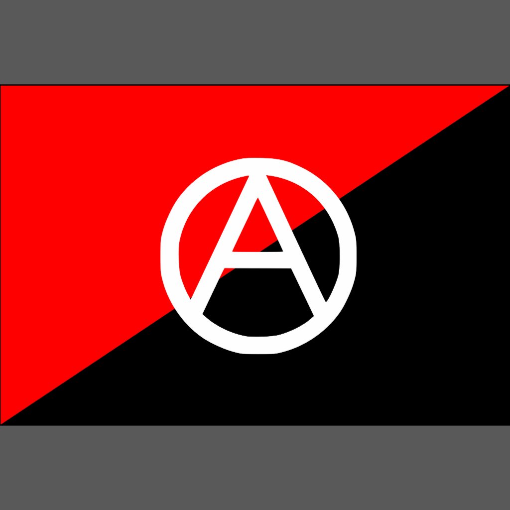
-Make the capital ‘A’ logo more modern and less intimidating.
-Re-think the current colour scheme.
- Outline the movement’s values as positive instead of ‘anti’ everything.
-A social media campaign can reach a lot of people.

Deliverables:
-          Re-brand the anarchist movement to include a wider audience and dispel any misconceptions.
-          Update and re-design the current logo.
-          Communicate organisation, progression and inclusion in the new brand.
-          Create a mock social media campaign.
-          Create a range of promotional materials- Posters, business cards, stationary, etc
-          A clothing line to wear at protests.
-          Style guide


Friday 25 September 2015

Starting point- Brief

I decided to take on Brief 1, which was the brand identity task. The brief was to create a brand identity for the global protests that are taking place, protests for the refugee crisis, against austerity, human rights, anti war, anti government etc To summarise these protests are against the powers that be, surging forward by the momentum of ordinary citizens.


Brief

Anti-government, anarchist groups have led the charge in a lot of protests and demonstrations. There are usually the most vocal, energetic and sometimes violent.

I think it would be very interesting to brand a somewhat criminal element of these global protests. This would give them a more wider appeal and accepted appeal.

Anarchist groups are scattered, fractured and are not a single entity so this is an opportunity to create a brand that unifies all these groups on a global scale. There are a few things these groups have in common that could be illustrated through this new brand;

  • Predominant colours are black, white and red.
  • They usually have a capital 'A' to identify themselves on posters,flags,banners etc
  • They are a very vocal,energetic group. Could be reflected in the brand.
  • Anti-government, anti-austerity, anti-war, anti-authoritarian, anti-capitalism. Values that very much line up with protests of today.

Deliverables:

  • Design a new logo that modernises the current capital 'A' logo.
  • Create a range of promotional materials- Posters, business cards, livery etc
  • Create a 'Protest kit'. Including branded face scarf, banner, flag, clothing line. 
  • Style guide
  • Perhaps illustration instead of photography